9 Serene Japandi-Inspired Paint Hues for a Tranquil Living Space
Explore a curated selection of earthy paint shades guided by professionals, unlocking the secrets to crafting a living space exuding timeless elegance through nine expertly recommended hues.
by Abinaya
Updated Jan 05, 2024
On This Page
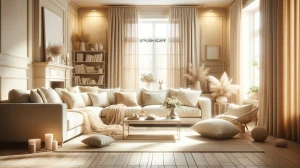
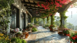
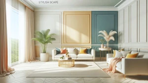
Step into the realm of sophisticated home decor where professionals guide you through a curated selection of earthy paint shades. In the quest to craft a living space that exudes timeless elegance, the choice of paint colors holds a paramount significance. Our guide unfolds with nine expertly recommended hues, each chosen by seasoned professionals in the realm of interior design.
These colors not only emanate warmth and tranquility but also seamlessly bring a touch of the outdoors into the heart of your home. Join us as we embark on a journey of aesthetic exploration, where each carefully selected shade has the power to transform your residence into a sanctuary of style and serenity. Within the upcoming pages, delve into expert insights that unravel the intricacies of each earth-toned paint selection.
This guide serves as your roadmap, promising to elevate your living spaces, whether you're aspiring for a cozy retreat, a modern oasis, or a timeless haven. These thoughtfully chosen shades assure your home becomes a canvas for timeless elegance, mirroring the beauty found in the natural world. Embark on this creative voyage and uncover the secrets to a home that not only mirrors your personal style but also stands as a testament to the finesse of professional design.
1.Soft Ash (Gray)
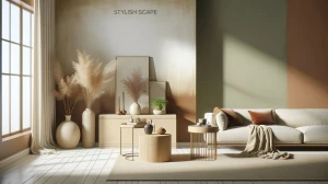
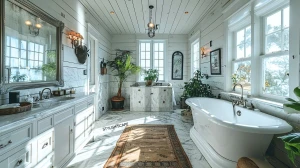
Soft Ash Gray serves as an ideal foundation for a Japandi-inspired living space, encapsulating the muted elegance inherent in both Japanese and Scandinavian design. This versatile hue not only complements the clean lines and simplicity of Scandinavian interiors but also reflects the traditional aesthetic of Japanese tatami rooms. Its warmth undertones create a cozy atmosphere, steering clear of a stark, cold feel.
Soft Ash Gray acts as a neutral canvas, allowing the incorporation of natural textures and elements, such as light wood furniture and minimalist decor, to shine. This subtle yet sophisticated color choice fosters a serene ambiance, making it perfect for walls, creating a backdrop that allows other design elements to take center stage.
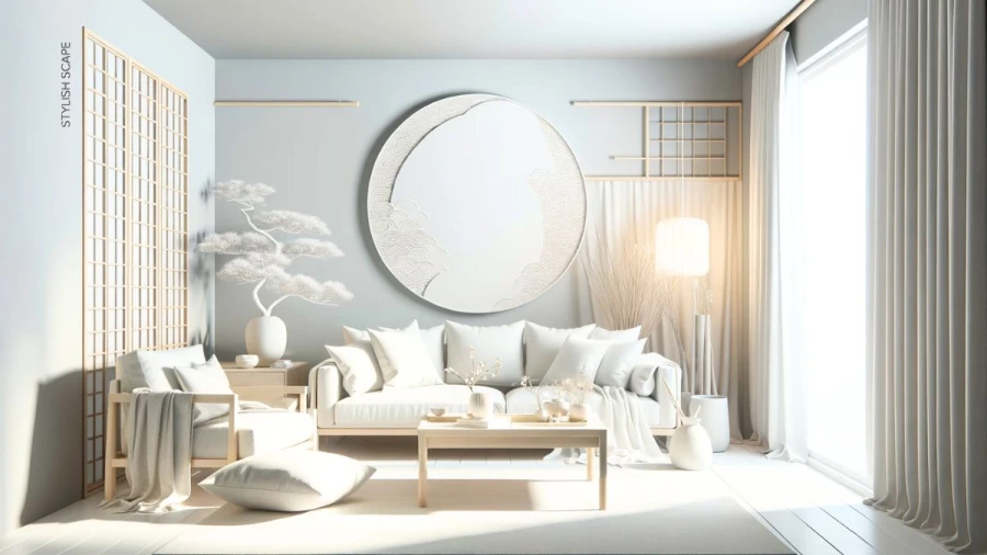
2. Zen White
The epitome of simplicity and purity, Zen White embodies the essence of both Japanese and Scandinavian design philosophies. This crisp and clean white hue not only brightens up the living space but also contributes to the minimalist aesthetic found in Japandi interiors. In Japanese culture, white is associated with purity and cleanliness, while in Scandinavian design, it symbolizes simplicity and a connection to nature.
Zen White helps create an open and airy feel, making smaller spaces appear more expansive and inviting. To enhance the tranquility, pair Zen White with natural materials like light-toned woods and soft textiles. This versatile shade acts as a blank canvas, allowing for easy integration of decor elements inspired by both design styles, fostering a harmonious and peaceful environment.
3. Moss Green
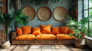
Introduce a touch of nature with Moss Green, a muted and calming hue that draws inspiration from the Japanese reverence for natural elements. This color, reminiscent of traditional Japanese gardens, seamlessly merges with the Scandinavian penchant for incorporating the outdoors into interiors. Moss Green creates a connection to the earth, fostering a tranquil atmosphere within your living space.
Consider using it as an accent wall or in decor elements like throw pillows and artwork to infuse a sense of organic beauty. Pair Moss Green with light woods and neutral tones to maintain the Japandi balance, creating a space that exudes serenity while bringing the calming essence of the natural world indoors.
4. Pale Bamboo
Echoing the warmth of light wood tones, Pale Bamboo adds a touch of organic elegance to your Japandi-inspired living space. This subtle hue captures the essence of bamboo, a material highly valued in Japanese design for its flexibility and strength. The color exudes a natural, earthy vibe, reminiscent of Scandinavian wood finishes. Use Pale Bamboo on accent walls, furniture pieces, or even in smaller decor elements to introduce warmth and authenticity.
This shade complements neutral tones and can be paired with darker accents for a balanced look. Incorporating Pale Bamboo into your color palette not only enhances the natural aesthetic but also adds a layer of authenticity that is characteristic of both Japanese and Scandinavian design principles.
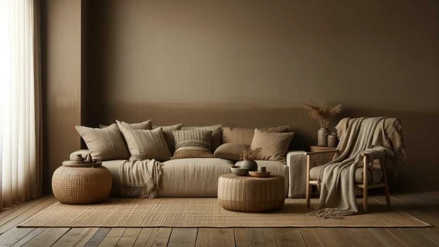
5. Earthy Taupe
For a grounded and soothing atmosphere, Earthy Taupe is an excellent choice that seamlessly integrates both Japanese and Scandinavian design elements. This warm, neutral tone brings a sense of balance and stability to your living space. Earthy Taupe serves as a versatile backdrop, allowing for the inclusion of various textures and materials, such as woven fabrics and natural wood, common in Japandi interiors.
This color choice creates a serene environment, making it ideal for larger surfaces like walls or as a base for furniture pieces. The subdued richness of Earthy Taupe adds depth without overpowering the space, contributing to the overall harmonious and tranquil ambiance.
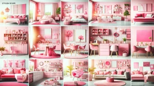
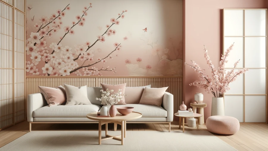
6. Cherry Blossom Pink
Embrace a touch of delicacy and cultural symbolism with Cherry Blossom Pink, a subtle yet impactful hue that pays homage to the Japanese aesthetic. This soft pink creates a serene and feminine atmosphere, reflecting the fleeting beauty of cherry blossoms in spring. Integrating Cherry Blossom Pink into your Japandi-inspired space adds a layer of sophistication and visual interest.
Consider using it as an accent color for textiles, decor accessories, or even as a feature wall in certain areas. The gentle nature of this pink tone complements the simplicity of Scandinavian design while adding a touch of cultural richness inspired by Japanese art and tradition, contributing to a tranquil living space.
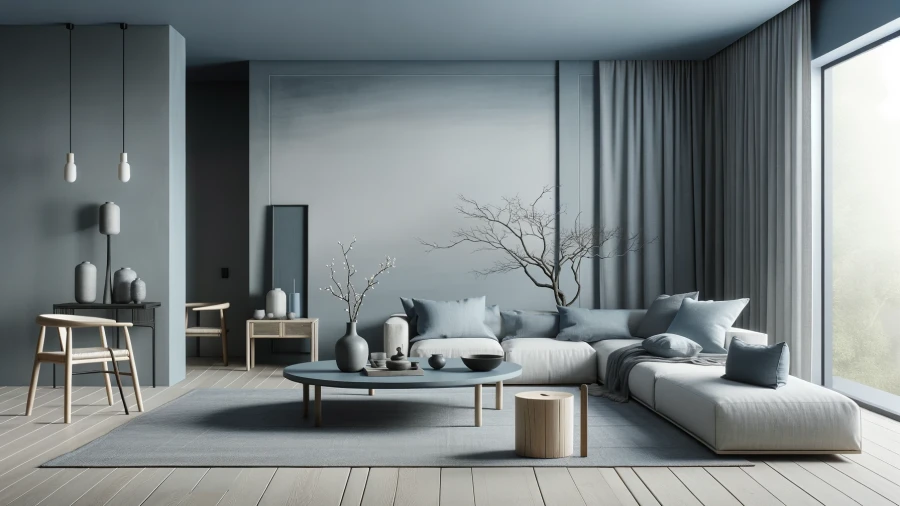
7. Minimalist Blue-Gray
Capture the essence of simplicity with Minimalist Blue-Gray, a muted and calming color that aligns seamlessly with the understated elegance of Japandi style. This sophisticated hue, drawing inspiration from Scandinavian cool tones, adds a touch of tranquility to your living space. Minimalist Blue-Gray can be applied to walls, furniture, or decor elements to create a cohesive and harmonious atmosphere.
It pairs well with natural materials like light wood and stone, enhancing the overall balance between the two design styles. The subdued nature of this color choice promotes a calming environment, making it an ideal candidate for creating a Japandi-inspired haven in your home.
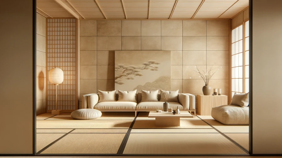
8. Neutral Stone
Infuse a sense of serenity and timelessness into your living space with Neutral Stone, a warm beige or light tan that captures the essence of both Japanese and Scandinavian design principles. This neutral hue creates a versatile canvas for various design elements, allowing the integration of natural textures and materials. Neutral Stone, reminiscent of traditional Japanese tatami mat colors, establishes a connection to nature and simplicity.
Use it on walls, flooring, or large furniture pieces to maintain a cohesive Japandi aesthetic. This color choice enhances the overall tranquility of the space while providing a neutral backdrop for other design elements to shine.
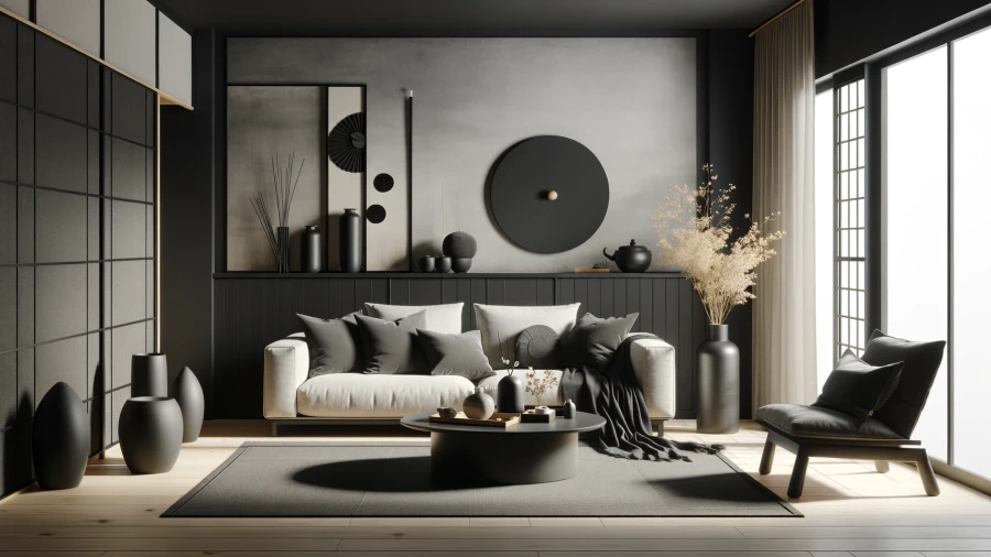
9. Charcoal Black
Introduce a touch of sophistication and contrast with Charcoal Black, a deep and dramatic hue that adds depth to your Japandi-inspired living space. This bold choice, inspired by the simplicity of Scandinavian design and the sophistication of Japanese aesthetics, creates a focal point in the room. Consider using Charcoal Black for an accent wall, furniture pieces, or decor accessories to infuse a sense of modernity and elegance.
Pair it with lighter tones and natural textures to maintain the overall balance of the Japandi style while creating a visually striking environment. Charcoal Black adds a touch of drama without compromising the serene ambiance, making it a versatile choice for creating a tranquil living space with a contemporary twist.
Related Articles
20 Wall Hanging Decor Ideas to Elevate Your Space
537 days ago
Disclaimer : The above information is for general informational purposes only. All information on the Site is provided in good faith, however we make no representation or warranty of any kind, express or implied, regarding the accuracy, adequacy, validity, reliability, availability or completeness of any information on the Site.